WORK / WEB + VISUAL DESIGN
Design, development, and the details in between.
I build WordPress websites that organize complicated content, make the next step obvious, and still feel like they belong to the people behind them. My work also extends into the visual pieces around those sites—from social and print design to image editing and vector assets.


SELECTED CASE STUDIES
Three sites. Three completely different problems to solve.
I do not force every project into the same visual formula. The common thread is structure: understand the real job of the site, make it easier to use, and build it so it can keep working after launch.
PROJECT / 01 · SERVICE BUSINESS
Triple Clean
A content-first rebuild for a cleaning company with multiple audiences, overlapping services, urgent hiring needs, and a quote process that needed better information before follow-up.
PROJECT / 02 · ARTIST + COMMISSIONS
CJR Arts
A portfolio relaunch designed to keep the artwork central while making commissions easier to understand, request, and manage across desktop and mobile.
PROJECT / 03 · CAMPAIGN WEBSITE BUILD
Hazelip for Idaho
A ground-up campaign site built on a compressed timeline, with custom forms, donation integration, recurring campaign content, and The Rachel Report publishing and newsletter workflow.
PREVIOUS WEBSITE WORK
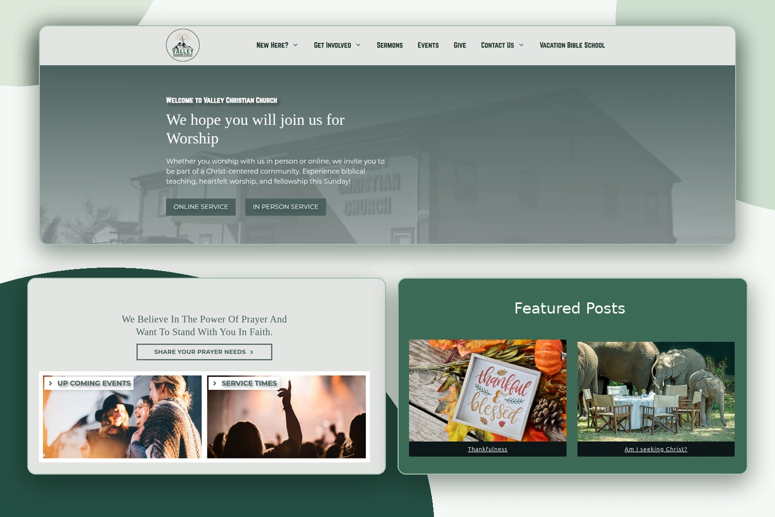
Valley Christian Church
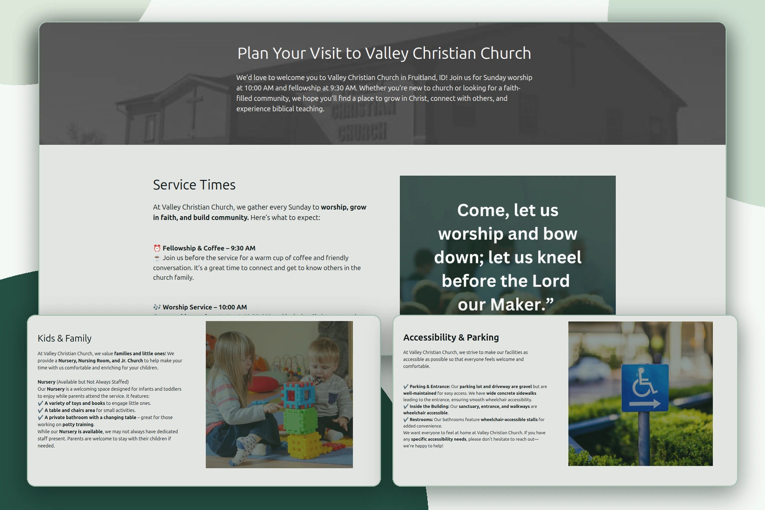
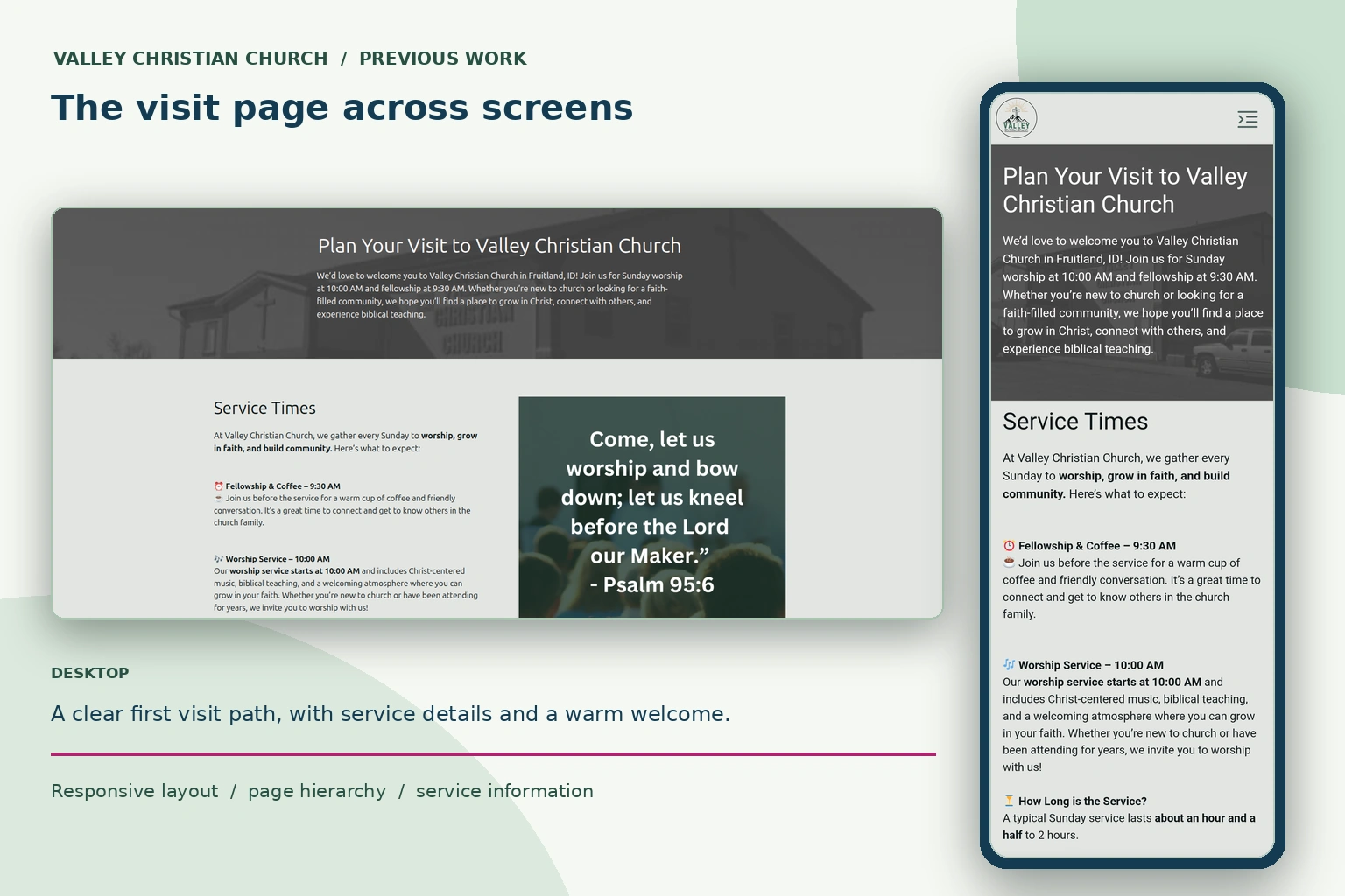
An earlier WordPress website designed to help visitors find worship details, explore church life, and know what to expect before coming in person. The homepage, visit information, and mobile layout show how the content was organized for different needs and screen sizes.
Selected past work · I no longer design or maintain this website.
MORE FROM THE SITE
VISUAL DESIGN / BEYOND THE BROWSER
The website is not always the whole job.
I also work in Canva, GIMP, and Inkscape when the project needs supporting visuals—social graphics, print pieces, image editing, web assets, and vector work. I like being able to carry an idea beyond the page instead of handing every small visual problem off to someone else.
Campaign, social + print layouts
Fast-moving design work where the message, hierarchy, and output size matter just as much as the visual style.
Image editing + compositing
Practical image work for websites and marketing: cleanup, crops, background work, compositing, export optimization, and visual assets.
Vector + SVG work
Scalable assets for the pieces that need to stay sharp and editable—icons, simple marks, SVG graphics, and interface details.
SELECTED CANVA WORK
Design beyond the page.
Flyers, newsletters, invitations, and outreach pieces from previous projects. Select a piece to see the designs up close.


WHAT TIES THE WORK TOGETHER
The polished part is visible. The system underneath is the real work.
The part I care about most is making the site easier to understand, easier to maintain, and harder to break. Good visuals matter, but they work best when the content, behavior, and technical details are doing their jobs too.
Clarity before decoration
I start by deciding what the site needs to say, what visitors need to do, and what information belongs together before styling the page.
Responsive by design
Desktop is not the master version. Navigation, content order, forms, images, and calls to action are refined for smaller screens instead of simply shrinking.
Accessibility in the details
Contrast, visible focus, logical headings, keyboard behavior, labels, alt text, readable spacing, and practical interaction states are part of the build.
Reusable, maintainable systems
Shared styles, patterns, and repeatable content structures keep growing sites consistent and make routine updates less fragile.
NEXT STEP
Want the short version? The résumé is next.
The case studies show how I think through the work. The résumé gives you the compact version of my experience, tools, and background.


